Friday, October 06, 2006

Logo ideas...

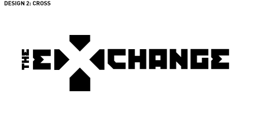
Here's a couple different ones. I tried to play with the font and the "X". One one of them I didn't use the "E". Maybe we don't have to? Or maybe we do- if it's the Cross idea. Not sure.
Well, I'm done rambling now.

Sunday, October 01, 2006

Josh's Logo Ideas

Hey Gang, Here are the best ideas I have regarding the logo for the Exchange. I just threw these together quick, so they're not to developed visually.

Design One: Stencil


The idea here is that the X would be knocked out of the frame so the background will show through. Playing off the idea that the figurative 'exchange' has already happened and the community of Christ fills the void. I think this would be a fun system use since it would use a lot of photos and show off the people that make up the church.

Design Two: Cross


After researching other logotypes using the word exchange or extreme it stood out that the X was usually emphasized by making it large and stylized. So that lead me to try and make the X out of the negative space. And that lead to a happy accident of the cross being the positive space. Its also signifies that the Exchange is some sort of ministry.